Monday, December 30, 2013

2013 Art Summary


A summary of all my work this year; of course there was a whole pile to sift though, but I do believe these were my more successful pieces including (in order):

:: University Projects
Under Milkwood (short film)
Sketches for the Blue Plaque Society
Book cover for Brave New World, Aldous Huxley; The Folio Society
Spread for The Cat Maiden, Aesop's Tales
The Black Cat (short film)
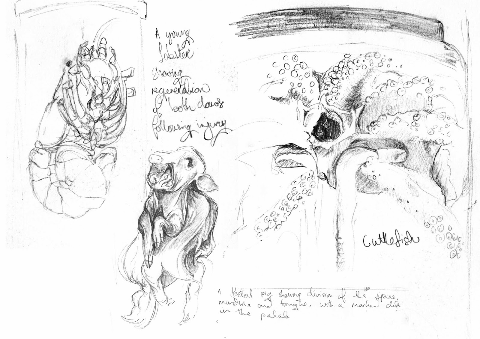
Portrait of a Camel; Derwent Pencil Prize
Reworked book illustrations for Brave New World, Aldous Huxley; The Folio Society

:: Personal Projects
The Red Wedding, reversible illustration
Bohemian, experimental illustration
The Grid Method: Jennifer Lawrence, a tutorial
Panty & Stocking with Garterbelt; fan illustration
Costumed Cats tiled pattern
Tea-Cloth tiled pattern
Newcastle Sunset, a work-in-progress digital painting
Grumpy Old Kayll, an experiment for a future short book
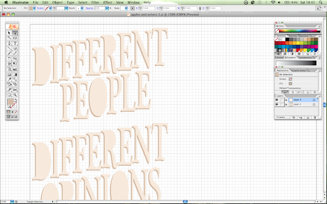
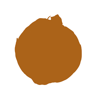
Apples and Onions, vector typography
(King Bee Projects) : Two backgrounds for Melody; TV Show; The Elves and the Shoemaker
Candyland, children's illustration to a written passage
My Miley zine contribution
Merry Christmas; penguin tree design
Autumn; a digital painting

My work has changed and varied so much that sorting through it all made me think a lot on it. An illustrator, I have been told, should have a 'style' that is inherently theirs, no matter the subject matter. I have become a jack-of-all-trades character as I have tried to overcome my weakest techniques. I know the drawing method I always use, but I also know the methods I have to use due to different jobs. We shall see how this pans out in 2014.

Happy New Year to all!

Sunday, December 15, 2013

Photoshop: Autumn (cont'd)

While organising my art folder and all the things I've been doing these past few months, I came across an unfinished painting I started back in September. I remembered those red trees, and I wanted to tackle painting a mountainous scene. 

So I started painting the mountains this evening...and I really liked how they looked, and wanted to show them off a bit more. The previous composition covered most of the mountain range - this was due to me liking the trees and thinking I could not paint mountains. What joy it is to persevere and to learn new subject matter. 

 I love capturing scenery and backgrounds (being fond of little details), so I really wanted to finish this off:

Autumn
 Photoshop

Here are the mountains in all their glory, because I do love them so:


Saturday, December 14, 2013

Christmas Cards (cont'd)

Happy holidays to my readers! I'm considering making shirts soon, and am researching various ways to do so. I am also making a comic book and a zine. Such great plans for 2014!


Wednesday, December 4, 2013

King Bee Studios Internship

As mentioned, I did a 6 week internship at King Bee Studios in London as an illustrator, and to get an insight into the animation industry. It was rather informative and stressed how very organised one must be, as well as being both quick to change little details, and continuously producing very good content. It was a rather stressful time as I helped on substantial projects - one of which is on air right now!

Here is some work I did while I was there:

'Rhino mascot' design; original head design by Francesca Tabasso. I worked on creating a more athletic body. The studio decided on the far-right stance. This was a one day brief, and the one I did on my first day.


Background edits for project 'Melody', currently airing on CBeebies! This was very exciting to be included in, if only for a snippet. The top images were the originals by Thomas Spettel. Shoes and character designs by Francesca Tabasso.


Character design for 'Penny Dreadful'. This was a project I was put on in my first week at the studio, and it was such a refreshing one. I was to come up with different styles of the characters. The cartoon show is to be based on the books by Joanna Nadin. It is written from the viewpoint of 10 year old Penny and they are such fun to read. I wanted to capture her vivid personality with bright colours and bold shapes. Here are my thought processes:


Polaroid designs for 'Soul Jump' characters, to be pitched to the Cartoon Sketch Show. Soul Jump are a band of "mismatched losers" who compete with another band for a record deal. These were done to a radio interview audio track, so I took my ideas from the things they said.


Sunday, December 1, 2013

Christmas Cards

I was initially going to put these up for sale, but I have yet to discover how.

#1 - Christmas Hunk

Friday, November 29, 2013

Candyland

My friend Abi is running a competition in her school, and the winners get to have illustrations of their written passages. The passage I received depicted a land made of candy, where we would do nothing but eat candy all day. Sounds rather wonderful and sickly at the same time!

Candyland
Photoshop


Passage:
In the future there will be a candy world with lots of sweets and candy canes. There will be different flavour cars like chocolate and strawberry. In candy world it will have final strawberry surs river. When it rains lovely chocolate surs comes down. In candy world we just eat candy. In candy world there are lollypop trees and we would lick them. 

It was so fun doing this piece, from rough (see below!) to the tiny details. I found myself looking up different kinds of candy to pop in, being more a fan of chocolates than candy canes and lollipops. It was just so good doing something bright, vibrant, and happy. (It’s been a challenging week with deadlines falling on the same day.)


This may have been the most vivid piece I've done this year. I might be pushing it. Time to use some dark colour palettes!

Friday, November 22, 2013

BOOK LAUNCH


Last year I made a book. This year it has been published. I AM SO EXCITED. I am officially a children’s book author and illustrator!

If you have young kids/cousins/siblings, or just like illustrations involving a cheeky mouse - then I encourage you to take a look! Do leave me a review/tell me if you liked it!


THANKS TO EVERYONE WHO PRE-ORDERED!!! I love you all so much! (I even signed one, which was exciting!)

Available for purchase (£3.99, free delivery):

Mooncotton
Althrop
Hampton Bond Books

Waterstones
Amazon

Bulk orders:
Bookshop UK

Friday, November 15, 2013

City People

This year has been a crazy year for travel, and I've seen some wonderful people on the way to and fro different parts of the UK, or within the cities themselves. The world is so metropolitan nowadays that you really do see various cultures and personalities. I've decided to capture them. They make the world so much brighter!

Here are the first two. More to come, of course. So many great outfits and looks!


V&A drawings

I will miss my time drawing in London museums. I have made good use of my weekends though, improving my skills. It started off quite difficult drawing from pure observation, especially with the bustle around... But I do like it. These were quite long poses, having found that the V&A have folding chairs available. How artist friendly!


Monday, October 28, 2013

Quick update!

It has been a long time since I have updated this space! This is due to one huge move that has happened this month: I became an intern at King Bee Animation studio, as an illustrator and partial animator. I've been working on future pitches, mainly character design and background design - images I can't exactly share since the pitches are not 'live' yet. As I am working in-house, full-time, I have had not much time to myself to have consistent updates, and my project schedule has unfortunately become rather messy.

However!- I am still drawing and sketching as much as I can; I'm already drawing about 7 hours a day, so my casual drawing is limited to weekends or free evenings. Weekly Jess is the one ongoing project I am determined to not fall short of.

Here are a few things I've worked on these past few weeks:


 A painting of the Northern Sunset
(Art Rage)


Ghost Cats and a Night-Witch
Character concept for a graphic novel


Studies at the British Museum
African Mask (markers); Greek Statue (pen); Egyptian Skeleton (pencil)


I have 3 more weeks at the studio, and then I will be able to resume my personal projects (they are definitely piling up) as well as finding a stable paying job!

---

Weekend museum drawing is becoming a thing!


Studies at the Hunterian Museum

What an absolutely glorious place this was!

Tuesday, October 1, 2013

WEEKLY JESS COMICS


WEEKLY JESS
is a comic-based series about funny and silly things I witness. I haven’t made a comic in years. The ones I have made were sadly damaged by heavy rain, and I no longer have the originals. I’m sure no one wants to see those oldies-but-not-goldies anyway!

Here’s the first strip - CANDY - based on a scene I saw almost a decade ago. Please give it a read and follow for more! WEEKLY JESS updates Tuesdays.


#1 - CANDY


I saw this girl when I was about 15, in the supermarket. I couldn’t help but giggle, and the story has stuck with me since. She was only about 5 or 6! Very cute. Explaining condoms is not hard to do, but explaining why they were flavoured - hmm!

Friday, September 27, 2013

Photoshop: Autumn

Today was meant to be a Chester day, but I have misplaced all my sketches, which means my only copy is in London. Terrible chance of events! Well I didn't feel like redrawing all the pages again, so I brought out the tablet and had a painting day.

The process

Here's an unfinished piece in the spirit of Autumn. Inspired by this gorgeous photo.

Trees are fickle


The next painting day is on Monday, I believe. Well... til then!


30/9:
 This document only has 3 layers

Wednesday, September 25, 2013

Typography 1/6

Different people have different opinions; 
Some like apples, some like onions.
To say that this is my first venture into digital would be a lie; but this is definitely the first time I've tackled vector typography, and it's the first time I'm truly happy with those digital paintings. Text and layout were done in Illustrator, paintings in Photoshop.


I may decide in a few hours that this is too bright, even for someone like me who adores bright colours.* I spent a lot of time choosing colours: I wanted a good solid contrast, just like apples and onions, and picked the colours out of the paintings, tweaking the saturation. In the end I went with Hugh Fearnley-Whittingstall's wonderful notion of "3 Good Things" (admittedly he's talking about food!): a limited palette of 3 colours does work in art too.

*I realise that I had uploaded a CMYK document, which is unsuited to web uploads. It has been replaced by the less vivid RGB document.

---
Related links:

TYPOGRAPHY PROCESS

ONION PROCESS

APPLE PROCESS

Monday, September 23, 2013

Plans and Deadlines

Typography project; a series of 6 - to be completed fortnightly

Weekly comics - starting October 1st

First of a series; children's book - 31st October (to be published for Christmas)

B.A.A. 2014 animation sting - Deadline November 29th

Christmas presents! - to be sent 30th November

Music Video animation; -

Old Man Kayll; - collaboration for 2014 Spring


Basically my next 3 months are JAM PACKED. But I've organised it all and it at least looks possible!

Friday, September 20, 2013

B.A.A. 2014: British Animation Awards


It has been brought to my attention that the B.A.A. 2014 deadline is November 29th. The brief is to create a sting, 4-25 seconds, must contain sheep! Bonus points if you reference British animation. Well this is a chance to make a mark in the animation world, so of course I'm going to try and churn something out!

I'm always worried about clichés, so I do hope mine won't fall in that category!


British Animation Awards: http://www.britishanimationawards.com/

Saturday, September 14, 2013

Illustrator: typography!

If you're not hand-lettering, Illustrator is a good way to go. Vectors are so good! Sadly since I only have CS2 it doesn't feel as advanced as the CS5 I was used to at Uni... But! It's just as useful for simple text editing.


Need to decorate those counters (empty letter holes)!


---
Update 15/9:


Started the next batch of type. Gosh trying to work out some letters was rather tricky. These do still need tweaking! Honestly, that P gave me too much trouble, when the solution was the easiest trick in the book (that's what happens when you think on an empty stomach!). And Illustrator kept crashing (I think the Undo and Copy/Paste cache is full); and I have learned that Scissors do not work if you have grid-locking on - who knew!

Not too shabby for an amateur typographer?

---
Update 16/9:


Hmmmmgghhhh I fixed the E ad S and now they look blobby and not so angular. I like that shade of green, might take it down a notch. The new text... I do not like so much. I think I'll experiment with cursive text.


Much better!

Friday, September 13, 2013

Photoshop: Onion

In conjunction with my apple, I made an onion. One of my typography projects was the phrase "Different people have different opinions; some like apples, some like onions". So here's the onion part of it!

I did this last night, for a couple of hours before bedtime: lots of blending and minor details.

 
GIF: the first couple of hours

Half done onion; finished product up soon!

---
Finished:

GIF: an hour and a bit later - all the details done!

Done!

The trick is to paint, blend, paint, blend, add texture, adjust colours, paint, blend, adjust, paint, blend, adjust...for however long it takes!

Thursday, September 12, 2013

Photoshop: Apple

I'm polishing up my digital/software skills! Since I am without a scanner, this is a necessary step.

This is an apple, painted in Photoshop. Over the next few days I'm going to churn out a bunch of digital work; I have plenty of experience with them, but I've been so caught up in my pencils, a big practice sweep is due. These may seem rather... dull(?) projects, since they're technical based, but I hope they're visually appealing.

Shiny version

Non-shiny version

(I should've made a gif.)

---
Update:

Since this will be part of a typography project, I'm opting for the non-shiny apple so it sits nicely against the non-shiny onion.

 I fiddled a little more so it's on par with the onion.

Wednesday, September 4, 2013

Moving! 2-week hiatus!

I am moving out of London for the winter. 

Instead of heading south, I'm going north! This means limited or no access to a scanner; so it looks like traditional art is on hiatus from the internet! I will of course still keep a sketchbook and I will be using it for a long while - but as far as posting online is concerned, it will most likely be full-on digital.

Moving will take a while, and I will need to find a job - so I'm hoping 2 weeks is all that is needed for focussed job hunting. Artwork will be back when my routine is sorted.

Thank you for sticking around! x

Typography Challenge!


Typography is defined as:
- The art or process of setting and arranging types and printing from them.

I know nothing about typography. I recently saw a great post on type, and was inspired by many funny quips from my podcaster and friend Thomas Kayll. Words have always been a big part of my life - books, poetry, plays; I grew up surrounded by these. My love for poetry translated into lyrics and sonnets, and I began listening to music for the words that resonated more than the beat.

When I put my portfolio together, I realised I had not explored typography. My work is full of mainly-University work, and we had not had much insight into this area. I took it on myself to figure out the basics, and to work with hand-created type.

This was my first venture:


I had a lot of fun with this piece; I did not have to think about fonts as I was copying the brand names. Since I am a meticulous, patient worker, I did have like spending time measuring and making sure the letters were correctly kerned. I think I did alright; but somehow after this, I ignored hand-inked type. When I created books and page spreads with lettering, I used standard fonts for uncluttered reading.

Now, I want to experiment and push this further. I am an illustrator, and it is not unlikely I will be twisting my words in a way that is much more visual. This challenge is a basic one; I asked the public for sentences or phrases from films, poetry, songs... Anything that had meaning, or anything that didn't. I would use these words to gain inspiration and create posters of type. I don't have access to a letterpress, but I can use pencils and paint brushes to create (I hope) beautiful text layouts.

---

Unfortunately, I am moving out of London for the winter. 

Instead of heading south, I'm going north! This means limited or no access to a scanner; so it looks like traditional art is on hiatus from the internet! I will of course still keep a sketchbook and I will be using it for a long while - but as far as posting online is concerned, it will most likely be full-on digital.

This just means I'm forced to use software - which is not bad at all for learning!