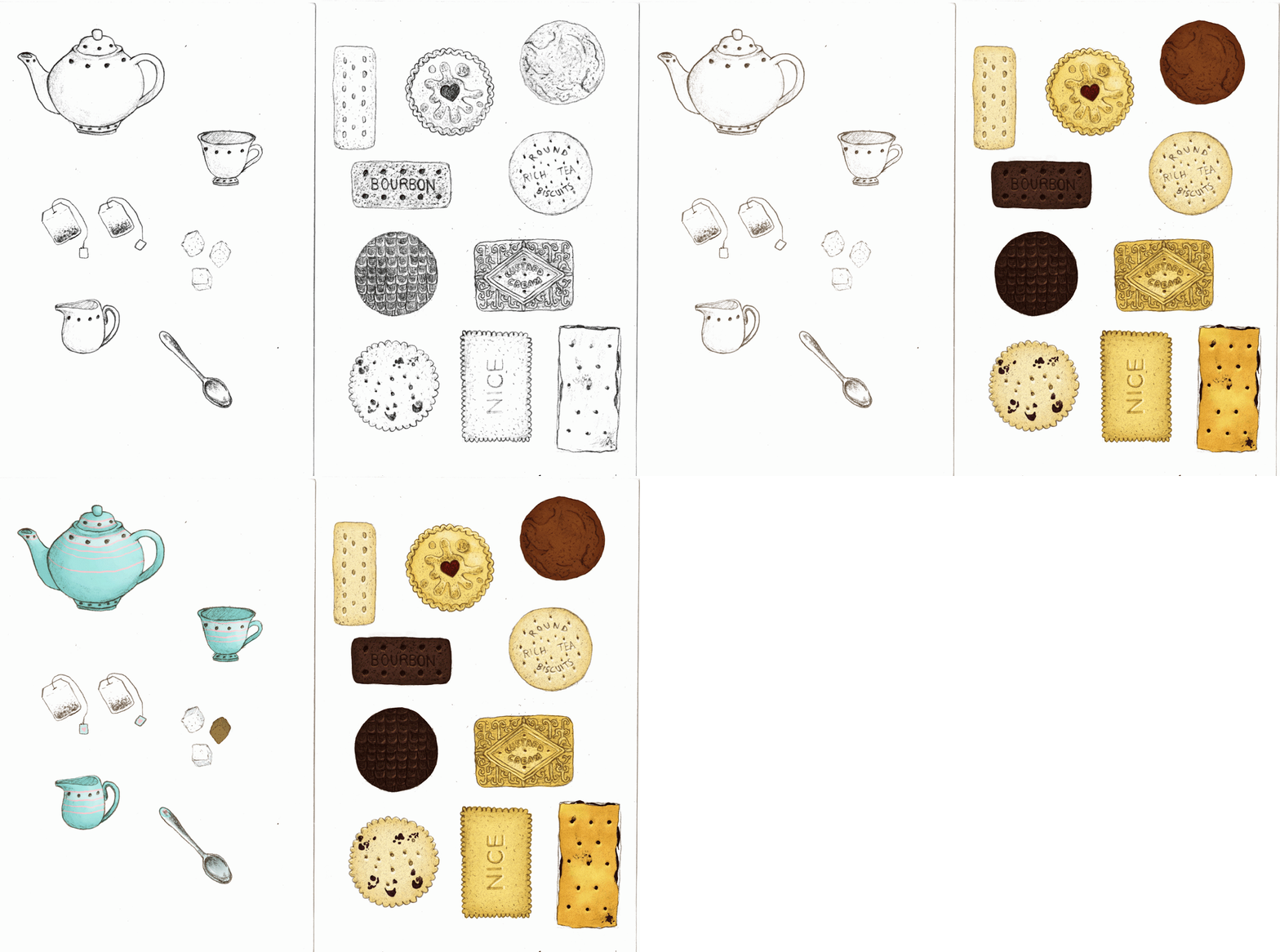
This is a teacloth pattern, inspired by the biscuits on my desk, and
how tea is a very nice beverage. This pattern went through a lot of
stages! My whole idea was to have scattered biscuits and tea items on a
sheet, the way they should always be shared.
1. First I coloured the items.
2. Then I had to arrange them, which took a lot of bother as my roughs
didn’t correspond with Photoshop’s rulers and guides, making very uneven
tiles. You can see that I have 2 types; the former items are quite
apart from each other, the second I made the items closer together.
3. At this point I knew that green colour was not right, and I began
putting down lots of different colours to see how it worked. I chose
green to be fresh and cheerful, but it didn’t make the items ‘pop’. So
after lots of colour changes (purple - girls playroom, pink - dollhouse,
blue - dulls it completely etc.), I settled on the most obvious choice -
tea-coloured brown!
4. I had done the wide-spaced tile before developing the close-spaced one,
so the negative space did bug me for a while, so I put down a simple
tablecloth pattern, something flowery and reminiscent of gardens. It
helped to conceal the negative space, but it also adds another layer,
making it seem busy. However, when I did the same on the close-knit
tile (
below), the pattern seemed to bond well.
Here is the final group tile, in all its tea-inspired glory!
I must explain that the reason for the close-spaced and wide-spaced
single tiles was me playing around with the aesthetic. I was finishing
these up to about midnight, and I realised that when I did tile them in a
group of 4, the amount of negative space was quite obvious. So I tucked
them a little closer to see the effect, and I do prefer the latter. The
biscuits don’t feel so lost, they’re bold and not swimming in a brown
sea.