Friday, September 20, 2013

B.A.A. 2014: British Animation Awards


It has been brought to my attention that the B.A.A. 2014 deadline is November 29th. The brief is to create a sting, 4-25 seconds, must contain sheep! Bonus points if you reference British animation. Well this is a chance to make a mark in the animation world, so of course I'm going to try and churn something out!

I'm always worried about clichés, so I do hope mine won't fall in that category!


British Animation Awards: http://www.britishanimationawards.com/

Saturday, September 14, 2013

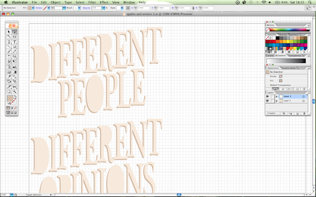
Illustrator: typography!

If you're not hand-lettering, Illustrator is a good way to go. Vectors are so good! Sadly since I only have CS2 it doesn't feel as advanced as the CS5 I was used to at Uni... But! It's just as useful for simple text editing.


Need to decorate those counters (empty letter holes)!


---
Update 15/9:


Started the next batch of type. Gosh trying to work out some letters was rather tricky. These do still need tweaking! Honestly, that P gave me too much trouble, when the solution was the easiest trick in the book (that's what happens when you think on an empty stomach!). And Illustrator kept crashing (I think the Undo and Copy/Paste cache is full); and I have learned that Scissors do not work if you have grid-locking on - who knew!

Not too shabby for an amateur typographer?

---
Update 16/9:


Hmmmmgghhhh I fixed the E ad S and now they look blobby and not so angular. I like that shade of green, might take it down a notch. The new text... I do not like so much. I think I'll experiment with cursive text.


Much better!

Friday, September 13, 2013

Photoshop: Onion

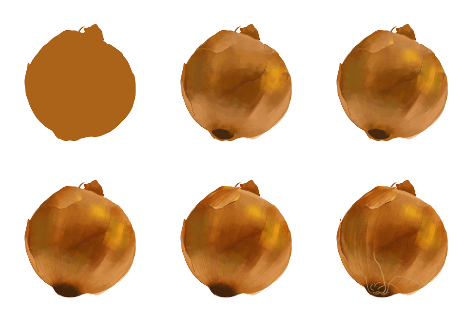
In conjunction with my apple, I made an onion. One of my typography projects was the phrase "Different people have different opinions; some like apples, some like onions". So here's the onion part of it!

I did this last night, for a couple of hours before bedtime: lots of blending and minor details.

 
GIF: the first couple of hours

Half done onion; finished product up soon!

---
Finished:

GIF: an hour and a bit later - all the details done!

Done!

The trick is to paint, blend, paint, blend, add texture, adjust colours, paint, blend, adjust, paint, blend, adjust...for however long it takes!

Thursday, September 12, 2013

Photoshop: Apple

I'm polishing up my digital/software skills! Since I am without a scanner, this is a necessary step.

This is an apple, painted in Photoshop. Over the next few days I'm going to churn out a bunch of digital work; I have plenty of experience with them, but I've been so caught up in my pencils, a big practice sweep is due. These may seem rather... dull(?) projects, since they're technical based, but I hope they're visually appealing.

Shiny version

Non-shiny version

(I should've made a gif.)

---
Update:

Since this will be part of a typography project, I'm opting for the non-shiny apple so it sits nicely against the non-shiny onion.

 I fiddled a little more so it's on par with the onion.

Wednesday, September 4, 2013

Moving! 2-week hiatus!

I am moving out of London for the winter. 

Instead of heading south, I'm going north! This means limited or no access to a scanner; so it looks like traditional art is on hiatus from the internet! I will of course still keep a sketchbook and I will be using it for a long while - but as far as posting online is concerned, it will most likely be full-on digital.

Moving will take a while, and I will need to find a job - so I'm hoping 2 weeks is all that is needed for focussed job hunting. Artwork will be back when my routine is sorted.

Thank you for sticking around! x

Typography Challenge!


Typography is defined as:
- The art or process of setting and arranging types and printing from them.

I know nothing about typography. I recently saw a great post on type, and was inspired by many funny quips from my podcaster and friend Thomas Kayll. Words have always been a big part of my life - books, poetry, plays; I grew up surrounded by these. My love for poetry translated into lyrics and sonnets, and I began listening to music for the words that resonated more than the beat.

When I put my portfolio together, I realised I had not explored typography. My work is full of mainly-University work, and we had not had much insight into this area. I took it on myself to figure out the basics, and to work with hand-created type.

This was my first venture:


I had a lot of fun with this piece; I did not have to think about fonts as I was copying the brand names. Since I am a meticulous, patient worker, I did have like spending time measuring and making sure the letters were correctly kerned. I think I did alright; but somehow after this, I ignored hand-inked type. When I created books and page spreads with lettering, I used standard fonts for uncluttered reading.

Now, I want to experiment and push this further. I am an illustrator, and it is not unlikely I will be twisting my words in a way that is much more visual. This challenge is a basic one; I asked the public for sentences or phrases from films, poetry, songs... Anything that had meaning, or anything that didn't. I would use these words to gain inspiration and create posters of type. I don't have access to a letterpress, but I can use pencils and paint brushes to create (I hope) beautiful text layouts.

---

Unfortunately, I am moving out of London for the winter. 

Instead of heading south, I'm going north! This means limited or no access to a scanner; so it looks like traditional art is on hiatus from the internet! I will of course still keep a sketchbook and I will be using it for a long while - but as far as posting online is concerned, it will most likely be full-on digital.

This just means I'm forced to use software - which is not bad at all for learning!

Saturday, August 17, 2013

Teacloth!

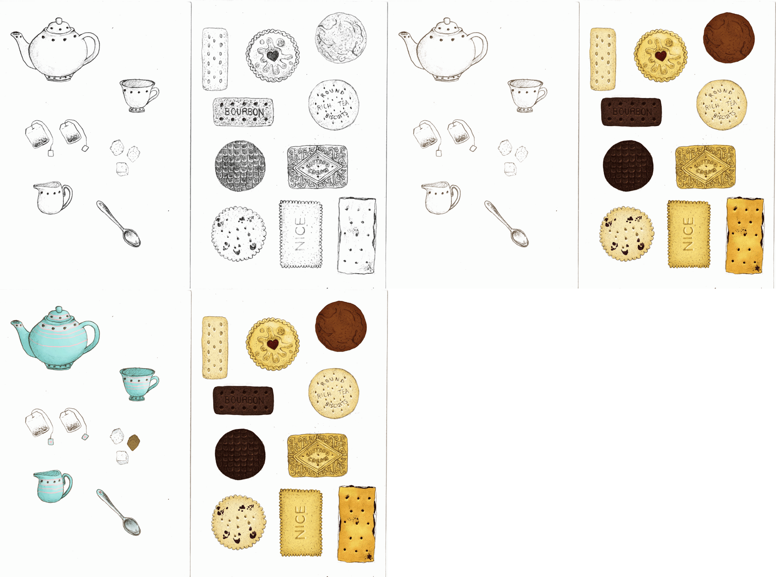
This is a teacloth pattern, inspired by the biscuits on my desk, and how tea is a very nice beverage. This pattern went through a lot of stages! My whole idea was to have scattered biscuits and tea items on a sheet, the way they should always be shared.

1. First I coloured the items.


2. Then I had to arrange them, which took a lot of bother as my roughs didn’t correspond with Photoshop’s rulers and guides, making very uneven tiles. You can see that I have 2 types; the former items are quite apart from each other, the second I made the items closer together.


3. At this point I knew that green colour was not right, and I began putting down lots of different colours to see how it worked. I chose green to be fresh and cheerful, but it didn’t make the items ‘pop’. So after lots of colour changes (purple - girls playroom, pink - dollhouse, blue - dulls it completely etc.), I settled on the most obvious choice - tea-coloured brown!


4. I had done the wide-spaced tile before developing the close-spaced one, so the negative space did bug me for a while, so I put down a simple tablecloth pattern, something flowery and reminiscent of gardens. It helped to conceal the negative space, but it also adds another layer, making it seem busy. However, when I did the same on the close-knit tile (below), the pattern seemed to bond well.

Here is the final group tile, in all its tea-inspired glory!

I must explain that the reason for the close-spaced and wide-spaced single tiles was me playing around with the aesthetic. I was finishing these up to about midnight, and I realised that when I did tile them in a group of 4, the amount of negative space was quite obvious. So I tucked them a little closer to see the effect, and I do prefer the latter. The biscuits don’t feel so lost, they’re bold and not swimming in a brown sea.

Monday, August 12, 2013

Cat wallpaper/tiled pattern


My very good friend Sammi, a wonderful animator, and I had a small chat about cats in costumes, and I could see them in my head quite clearly. Now, I love drawing cats - they are graceful and so flexible, and they're even better in clothes! I drew 6 cats, edited them started to work them into a tiled pattern. I had absolutely no experience with this at all - but first time for everything. I know now that it wasn't as straight-forward as I thought! I ended up with a lot of negative space, and I didn't know how to fit everything I wanted into it. In the end, I think I managed a pleasant layout - still got a lot to learn - but I do like the colours, and it was a fun experiment.


 ---
Update: This has been featured on Pussies on Parade; very exciting!


The Grid Method: Jennifer Lawrence portrait


I was asked once, how to draw. Drawing is complicated...where do you start? There are many ways I begin drawing, and this is (I find) easiest when drawing from a photo. It is not the same as drawing from life, unless you have a camera obscura. Personally I prefer drawing from life, but I use the Grid Method when I do large-scale pieces (I don't have a projector) as it helps keep everything in proportion.

The Grid Method is an Old Masters method and there are pros and cons.
Pros are - with a grid, it is hard to go astray, and you will have a successful drawing if you have the patience and you draw an accurate grid. This is good because you will be encouraged to keep drawing. You will start to notice that shapes are very important, as well as lighting and shadows. Grids can help you focus on small parts at a time; very good for a novice.

Cons are - you will be limited to drawing from photos/images. This is not bad if you are setting up your own photos, and are thinking about composition - but copying others' photos (like this one here) restricts creativity. You do not get the same knowledge of how things are in real life (figure anatomy, how apples are actually quite knobbly etc.), and I strongly encourage you to work from life.

Nethertheless, here is the Grid Method. Individual images can be found here.

Thursday, July 4, 2013

Panty & Stocking with Garterbelt

Panty & Stocking with Garterbelt
Pencil and Adobe Photoshop
July 2013

The only comment I can make is - one episode in and I want to be part of this show.